How to Map Your Workforce Commutershed in ArcGIS Online
By: Stephanie Smith, University of Arizona MS Student
Hi, I’m Stephanie Smith, an urban planning grad student specializing in small towns and recreation economies at University of Arizona. I want to share a GIS approach to mapping commutes with you that has helped me and the Gateway and Natural Amenity Region (GNAR) Initiative research team I work with map workforce commutes in the areas we study. This GIS map is called a ‘commutershed’ map, and the directions below will show you how to create one — whether or not you have prior GIS mapping experience.
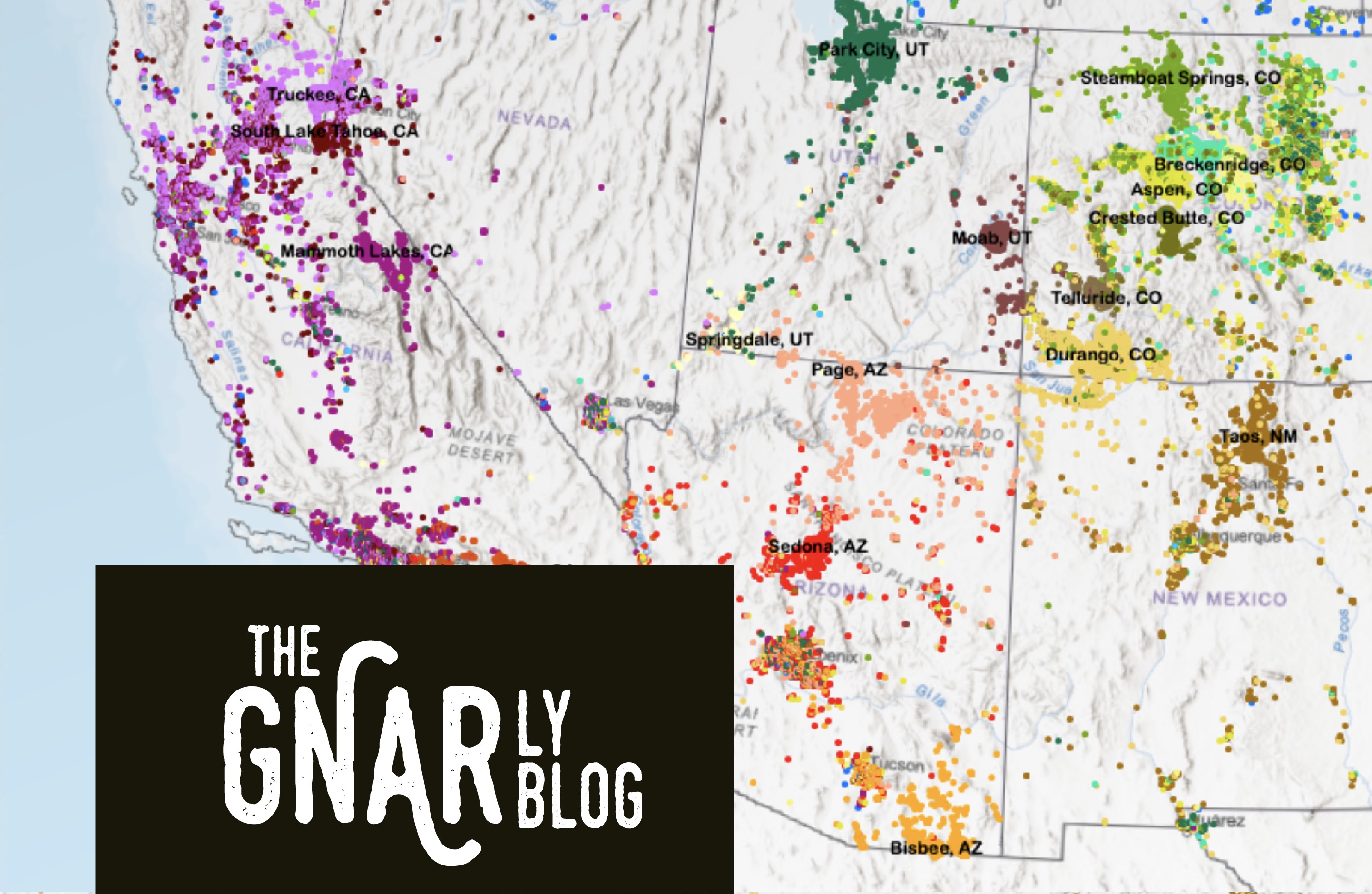
A commutershed map uses census LODES data to visualize where an area’s workforce lives. Mapping a commutershed can be a great way for an area’s municipal government, its planning staff, chambers of commerce, community groups, and other stakeholders to better understand how far its workforce is commuting, and from where. Check out LODES commutershed maps for several GNAR communities.
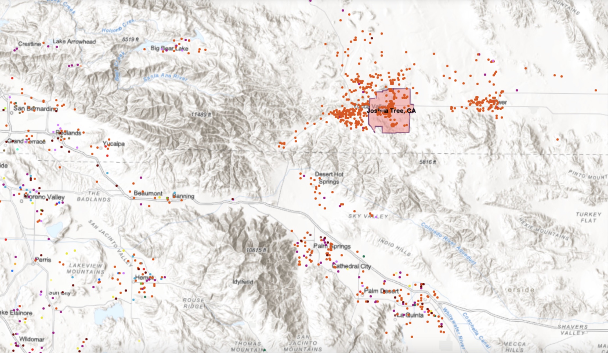
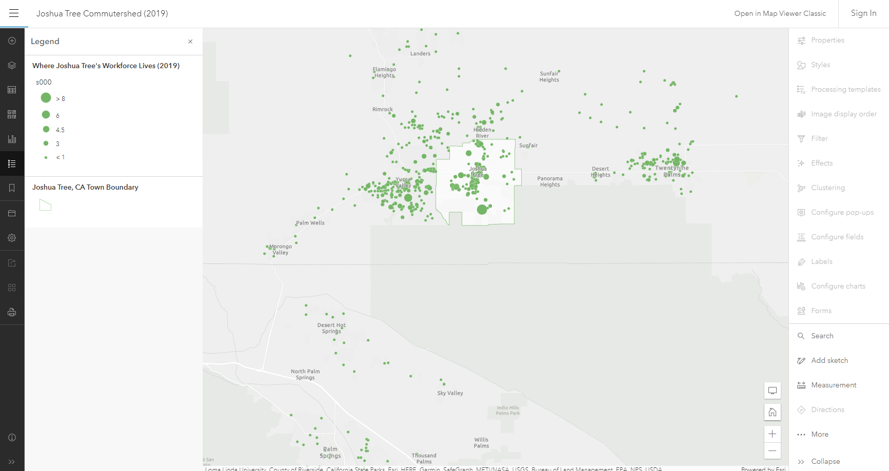
A commutershed, like the one above for Joshua Tree, CA, a gateway community situated at the entrance to Joshua Tree National Park, shows where people who work in an area live, with each point representing one or more residences (the bigger the point the more residences). Using the Joshua Tree example, many workers live and work in Joshua Tree (see the points within the white town boundary above), but many don’t, and must commute. Some workers commute long distances, driving ‘stretch commutes’ of 50 miles or more each way to work.
One factor in the decision of where to live is how much affordable housing there is. In Joshua Tree, many service and other workers can no longer afford to live in town, in large part due to the rise of short-term rentals, which have triggered price increases in the housing market. Mapping a regional commutershed and then comparing housing costs across areas (see the ‘how to’ in Part 3 below), may add additional insight into why commuting patterns are changing.
In the directions below I will walk you through how to map a commutershed for any area that is designated by the census (census designated place (CDP), city, metro region, county and so on). I will also show you how to map multiple towns in one area to create a regional commutershed, for instance unincorporated CDPs in a county. And finally, you’ll learn how to add more data from the census to compare housing costs in the areas you’ve mapped.
This exercise requires the online software ArcGIS Online. Many GIS and planning professionals have an ArcGIS Online account, but if you do not, ArcGIS offers a free trial, and also extremely reduced rates for personal use ($100/year).
By following the ‘how to’ directions below you should have your first map in about 30 minutes.
In case this is helpful, we also have a video on LODES commutershed mapping.
(Image: Commutershed example from Joshua Tree, CA)
Let’s get started...
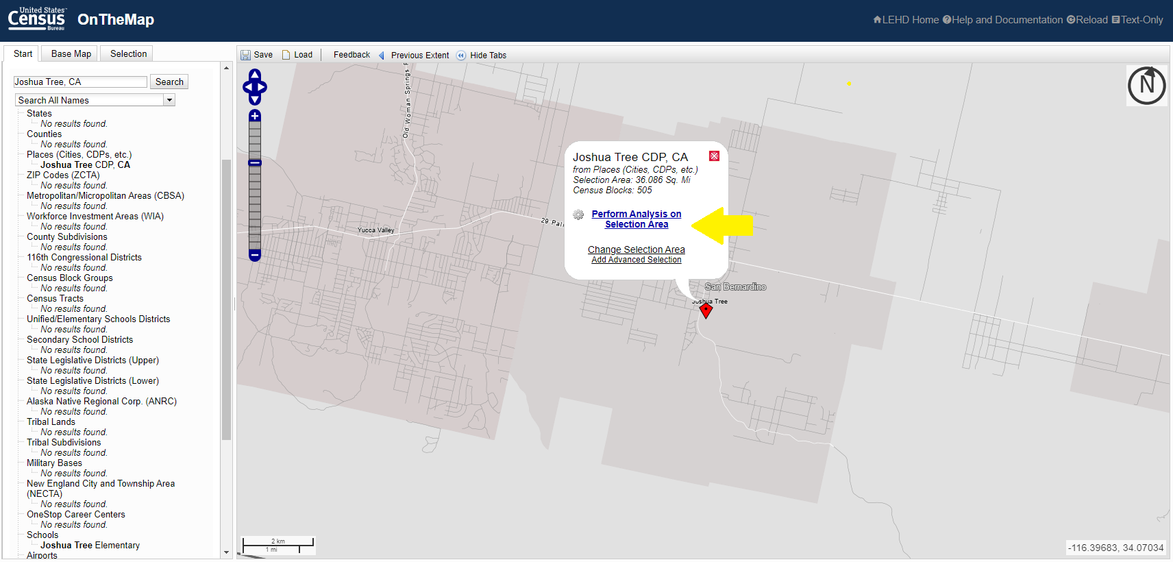
2. Go to https://onthemap.ces.census.gov/
3. Enter your place of study in the Search box and click on the place title from the list of options that load.
4. In the pop-up that appears on the map, click ‘Perform Analysis on Selection Area’.
Home/Work area = Work
Analysis Type = Distance/Direction
Year = as needed — run a number of years if you would like to compare changes over time
Job Type = All Jobs
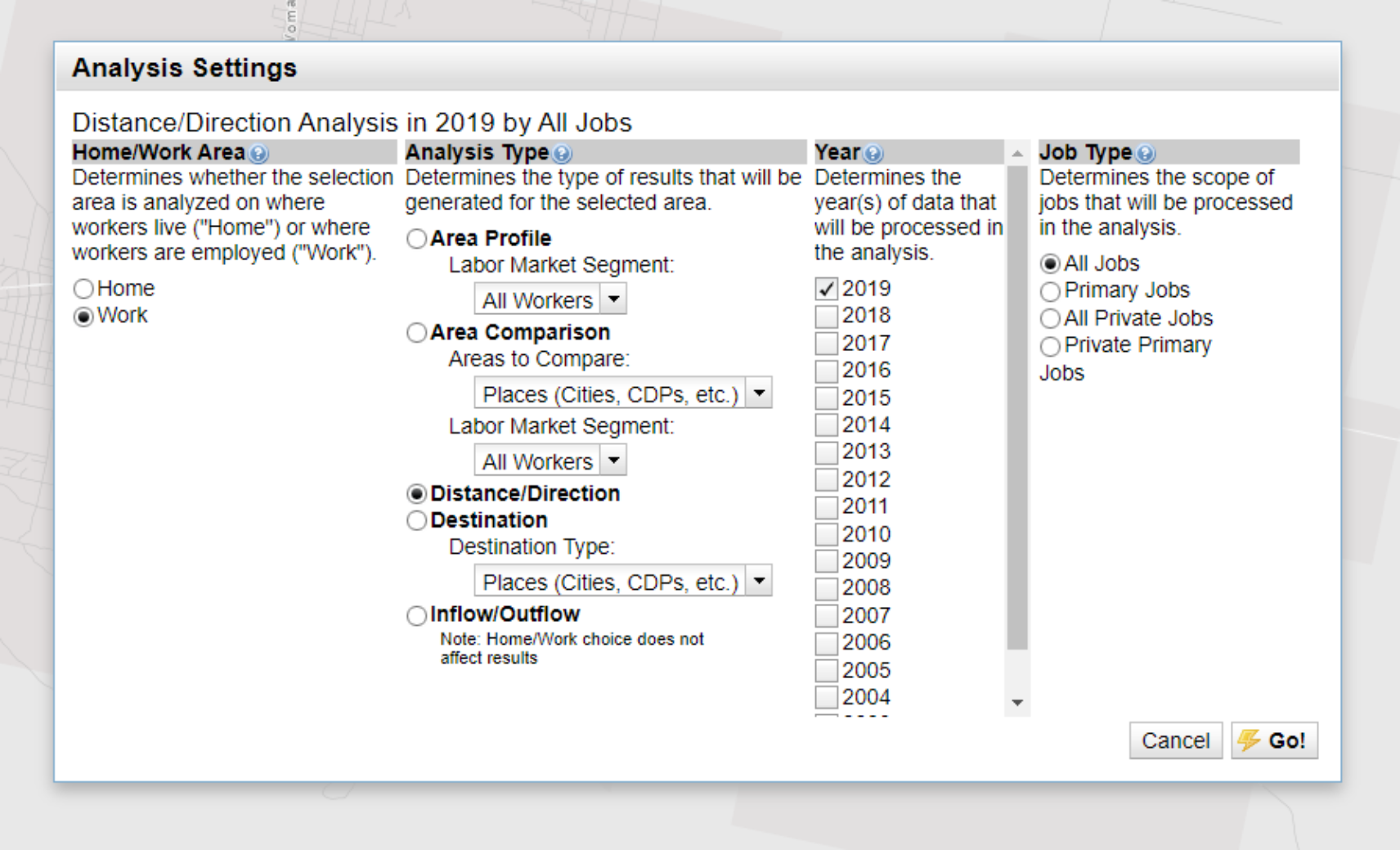
6. Click Go
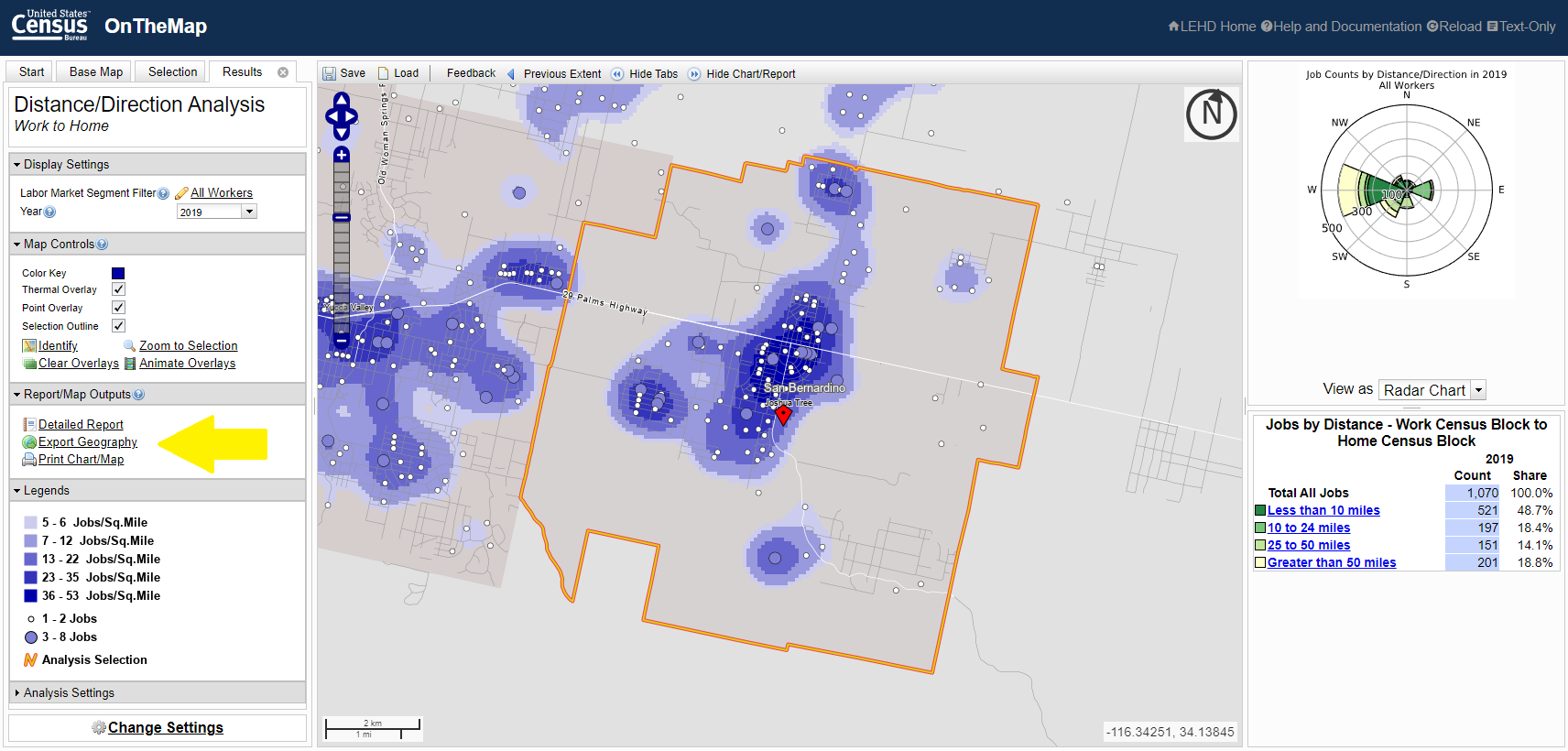
8. Choose as your export format Shapefile, click Okay, and then click Download Geography Export to download**.**
9. Feel free to move, but DO NOT EXTRACT this zip file.
Complete the above steps for every place of study you want to map (for instance, a number of towns in a county to create a regional commutershed — see the ‘how to’ below).
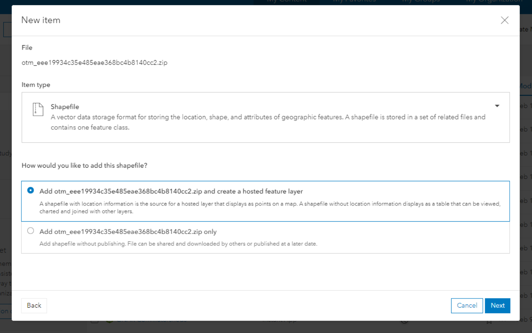
2. Click Your device to upload the zipped file from Part 1 (above).
3. As Item type choose Shapefile, and add the shapefile as a hosted feature layer, then click Next.
5. The commutershed data is now hosted as a feature layer in ArcGIS and can be mapped. To map, click on Open in Map Viewer in the upper right corner, then zoom to locate your place of study on the map. You will see many dots. Click on a dot and a pop-up will appear.
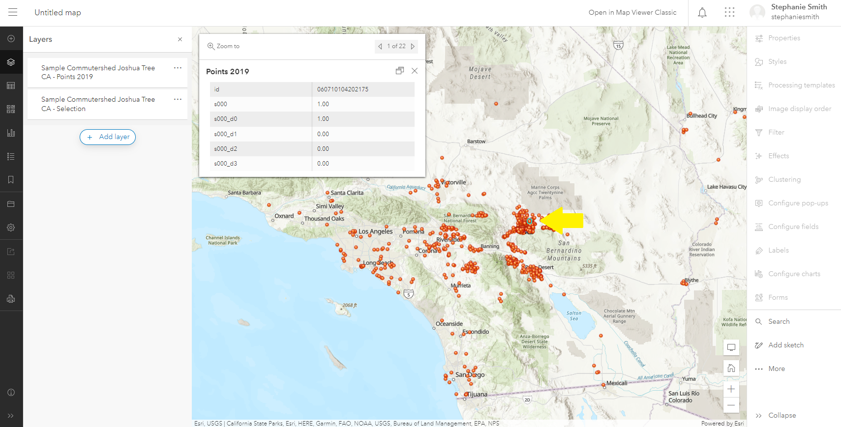
6. The pop-up table shows the underlying data. Each point represents a worker, or multiple workers, who live in that block group and work in your place of study. The pop-up row labeled id is the geoID of the block group. The pop-up row labeled s100 shows the number of workers (1 or more). The other labels — s000_d0, d1, etc — show more nuanced data about the labor market segment of these workers (which we will not focus on in this exercise).
7. On the left of the screen under Layers are the two layers that were uploaded in the zip file. The first, titled Points [data year], contains Points (as described above), the second, titled ‘Selection’, contains the Boundary of the place of study. The layers can be visible or invisible. Scroll over the three dots to the right of the layer title and an ‘eye’ appears. Click off or on for visibility.
8. Let’s use symbology to make this data easier to understand. First, let’s symbolize the Boundary. Click on the ‘Selection’ (i.e. Boundary) layer and a new panel will appear on the right. Under Symbology click on Edit layer style. Click Style options then use the pencil icon to edit the Boundary. In this example, I made the Fill color white, and more transparent, and made the Outline stroke green. Click Done when complete.
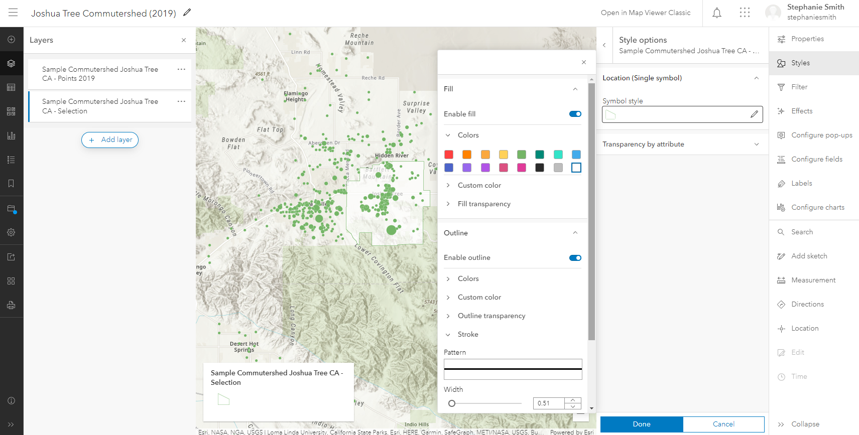
9. Now let’s symbolize the Points. Click on the ‘Points’ layer and in the right panel under Choose attributes click +Field and choose s000 (which represents total workers, as described above). The drawing style will auto-load Counts and Amounts (size). Use this symbology, with the **Theme ‘**High to low’ and click Style options. Click on the pencil icon to adjust Symbol style. Choose whatever colors, shapes and line widths you wish. For Size range I chose 6 to 20, which gives a balanced proportion, with block groups with less workers shown smaller, and block groups with more workers shown larger. Click Done when complete.

10. To save the map click the File symbol on the far left navigation bar (in black). Add a Title to the map, tags and summary data as needed, then click Save map.
11. To prepare the map for an audience, let’s change the Layer names by clicking on the three dots next to the Layer title and clicking Rename.
12. Use the widgets on the right navigation bar to Configure pop-ups. Click on the down arrow next to Title to Rename. Click on the Fields list to remove the fields not relevant to the map (everything but s000).
13. Change the Base Map using the Grid symbol on the far left navigation bar.
14. Save your map.
15. Share your map by clicking on the navigation dropdown in the top left corner and choosing Content. In the content list you now see your Web Map at the top of the list. Click on the title and on the right navigation click Share. Choose your sharing level on the pop-up screen. Click Okay, and if a second pop-up appears, click Update.
16. To create a sharing link scroll down to the Details section and click on the short link icon (to the right, below the stars). Copy and share the link as needed.
17. See my version of the map here: https://tinyurl.com/ypx9r7se. Access the Layer pane from the left navigation bar and toggle layers on/off and re-arrange as needed.
2. In ArcGIS Online, follow steps 1 - 4 in Part 2 (above) to create a feature layer for each new place of study.
3. To bring these layers into your original commutershed map, click on the title of the original map on the Contents page and then Open in Map Viewer. In the Layer pane at left click on Add layer. The new feature layers you added will be listed at the top. Add the layers.
4. For each place of study, the Boundary layer and the Points layer will appear. Follow steps 8 - 10 in Part 2 (above) to symbolize and re-title these layers. You may choose to give each place of study a different colorway to differentiate among the commutes.
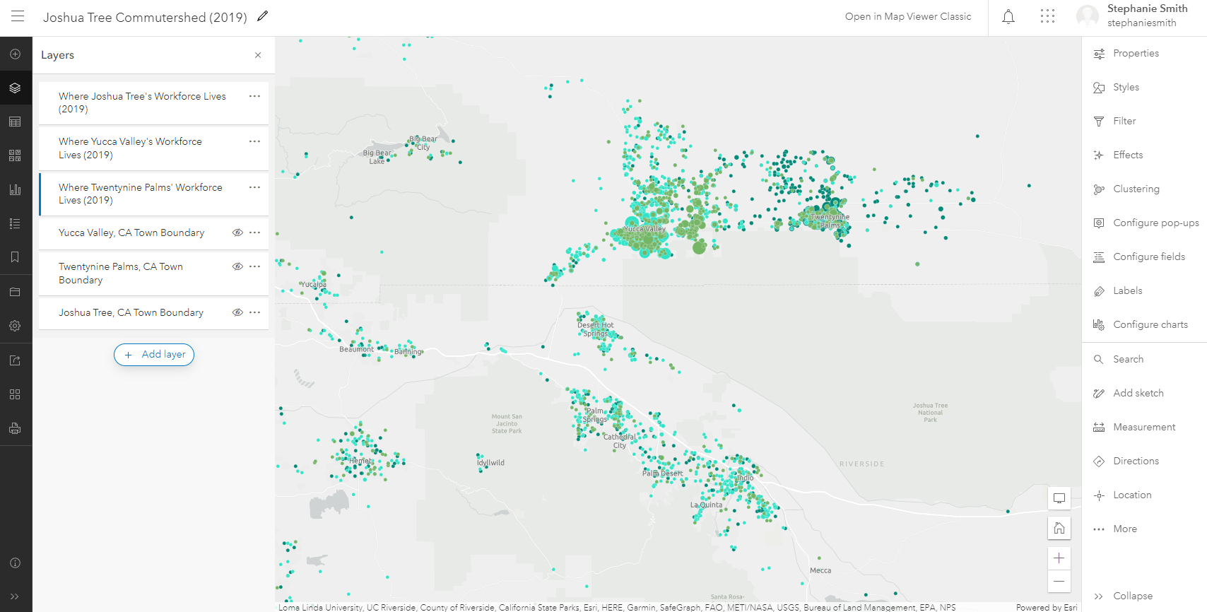
5. The Layers in the Layers list can be re-arranged by grabbing and moving them up or down. This allows the most important points to appear on top. Layers can also be hidden by clicking the Eye symbol on or off as needed. The map below shows the Joshua Tree - Yucca Valley - Twentynine Palms regional commutershed in various colorways, with the town boundaries turned ‘off’.
Census data can be added as a layer to give more insight into commuting habits. For instance, adding housing cost variables from the ACS may illustrate that workers are living in areas with cheaper housing and commuting to more expensive areas in order to work.
To add more data to your commutershed map:
- In the Layer pane on the left click Add layer. Click on the down arrow next to ‘My Content’ and choose Living Atlas. In the Search for layers box enter ‘acs housing cost’ and hit enter. The ACS Housing Costs Variables layer will load. Add it to the map. Arrange and symbolize the layers (showing variables for Tract, County and State) as needed.
- Save your map, then click on the Share arrow icon to share your new layers publicly. Update sharing controls as needed.
Limitations
Note that LODES data has a few weaknesses: It does not track seasonal or construction workers. Additionally, there is ‘noise’ added from a small amount of intentionally unrelated data so that the privacy of individual workers is protected.
Despite these weaknesses, a LODES commutershed map can be a quick way to get a rough understanding of your community’s workforce commute. Adding cell phone or other such data can round out the picture.
Thanks for reading and happy mapping! Reach me via Linkedin if you have any questions or comments.
 STEPHANIE SMITH is currently pursuing a mid-career Master of Science in Urban Planning degree at the University of Arizona specializing in small towns and regional sustainable tourism. Her minor is in GIS and data analysis. She spent 10+ years living and working in Joshua Tree, CA as a designer and small-scale developer before moving to southern Arizona. Smith has taught graduate-level design studios and lectured widely. Her previous master's degree is an M.Arch from Harvard University GSD, where she completed a published thesis (Great Leap Forward) with Rem Koolhaas and Harvard Project on the City.